- you can copy or get the image that is the porche on the beach by copy or pasting it or making a selection and using the move tool to drag it or use the layer and drag it to the beach.
- cntl+t transforms the image.
- zoom ouit if u cvant c ur handles. hold down shift when u use transform to increasee or ruce the size.
- when ur done transforming it pres enter and u can transform by right clicking it.
- MASKING OUT
- THE SHORT CUT to make ur brush smaller the left bracket makes it smaller and the right square brackets make it bigger or u cud use the right clcik and dont 4get to chasnge the hardness.
- use the hard brush to go around objects and use shift to clcik on it and shift to click on another point to make it come thru that point where u clicked after.and use a bigger brush .
- and use a soft brush and low opacity to blend
Friday, February 18, 2011
notes
Thursday, February 17, 2011
-how to navigate or move around-spcebar or grab ur tool or just clck on the hand tool.
-what are the default colors in photo shop and how do u make dem default...balck and white and clck on the smaller boxes and u will hav ur default colrs back
-why selections are important?---for u to isolate something.
-how do u add to a selection-shift
how do u subtract a selection-alt
how do u deselect-cntrl d
shortcut to fill-alt+delt
how to inverse-
-how do u make a selection if u have not saved it-well one way is to save ur selection and the other way is cntrl+click the thumb nail on the layer on the right side.
-please name ur layers.
duplicate ur background layer all the time....
Wednesday, February 16, 2011
notes-
if you want to move several layers at the same time, use shift to select them.
if you want to edit the background layer, double click it and just rename it.
how to get the selection back: ctrl +click the layers thumb and now you have a selection.
the short cut to fill is the key alt + delete.
work flow:name alll your layers. double click on the layer and name it.
if you are in ever doubt please slowely turn all your layers off.
Tuesday, February 15, 2011
-USE THE TEXT TOOL, WRITE UR NAME.
- the text tool is in T.
- rite click on the layer to rasterize type it.
- you gonna drag that type to a new layer at the bottom where the new layer is. you shud hav 2 copies
- at the top you have the move tool.
- lock the transparency and make sure u lock it with lock tool
- under edit menu, fill with black .
- now you have a white and a black text
- turn the lock offf because u will blur it.
- filter>blur>glassain blur.
- reduce tyhe opacity of it.
- move the shadow under neath it so its sitting underneath the white layer.
how to make a blapple
steps
-qiuck selection tool
- selct my background.
-then usr the polygonsl lasso tol to select the stem.
-then invert that selection.
-click on the layer adjustment.
-qiuck selection tool
- selct my background.
-then usr the polygonsl lasso tol to select the stem.
-then invert that selection.
-click on the layer adjustment.
Monday, February 14, 2011
notes
deselect-cntl+d
invert a selection-shft+cntl+I
shft+cntl+i
under image click adjustment-hue saturation
how to get the watch on a difff layer
you can copy and paste or drag using the move tool- its on the top right corner.
1. select
copy an paste
or if oyu have 2 images open, you could have drages it to the layer.
to turn the layer on and off clcik on the eye beside the picture ...you just hide it, not delete it.
how to clolor in and make as hadow
clcik on lock transparency ..on the layer itself it has an icon of lock
go to edit and fill press ok.and it fill
next, how to blur or make as shadow...its under the menu filter, the one you shud choose blur choose gussain blur.xdo unlock the layer first and clcik on the unlock button. and den filter it again and make it blurry.
to get a selection back, hold down the ctrl key and clcik on the little pic on the layer.
change the opacity
Friday, February 11, 2011
under select at the very down bottom select save
and give it a name.
u can save ur seelction and load it back on and wen u hit selction it will be back.
change color its under the image menu click adjustment and click on hue selsction.
short cut for hand tool is space bar .
if u want 2 zoom in space bar +cntrl lets u zoom in .
space bar cntrl alt- u can zoom out.
to add to as election hold to shift
pres alt to remove it...
shift is add and alt is subtract.
Monday, February 7, 2011
Principles of Design Scrapbook
ELEMENTS OF DESIGN
LINE

Line is defined as a single-color design made with one pen or a pencil with less or no shading effects other than parallel lines crossing each other. It is any mark connecting two lines.
If you look around, you have many kinds of lines, for example, straight, thin, fat, squiggly, and dotted lines.
SHAPE
Shape is a form of an object : the way it is laid out in the gap. Shape is not what it is made of or where it is. some basic or simple shapes are circles, squares, triangles, etc(two dimensional) spheres, cubes, pyramids(three dimesnsional).

The image is of wet sand patterns that you can find at the beach. It communicates the nature of the object.

COLOR

Color can be a bit too strong. It can be used to define or simplify an object. It can be represented in an emotional way , that is blue for sadness, red for anger, yellow for happiness, etc, symbolically, and psychologically.
PRINCIPLES OF DESIGN
SYMMETRICAL BALANCE
When a design can be equally separated both vertically and horizontally, then it has the most entire balance possible,this is called symmetrical balance.
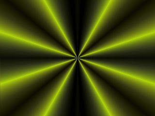 They would nearly have the same visual mass.


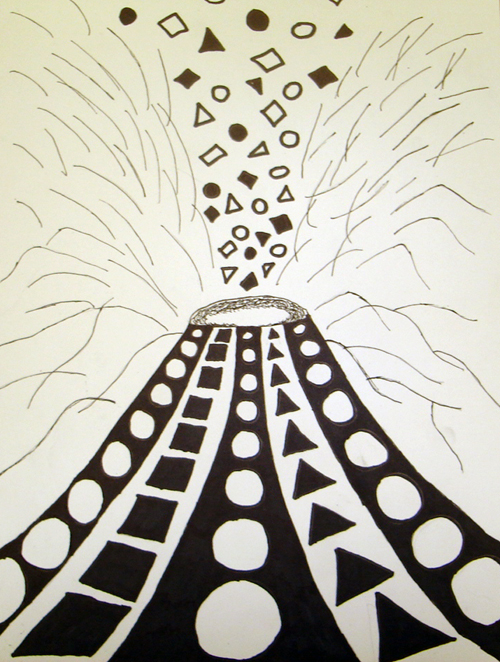
RHYTHM
Another word for rhythm is repitition. It is the basic principle of design.
It is a principle of design indicating movement which is achieved by the repitition of beats, lines or shapes.
PROPORTION


When a design can be equally separated both vertically and horizontally, then it has the most entire balance possible,this is called symmetrical balance.


This piture above and below can also be divided equally.

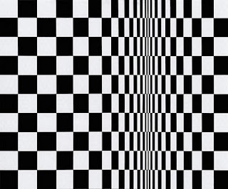
ASYMMETRICAL BALANCE
It is an arrangement of contrasting items of the same mass on each side of the sheet. Color, worth, amount, shape, and quality can be used as balancing elements.
 Asymmetrical balance is also the art of balance with a sense of unbalance.

RHYTHM

It is a principle of design indicating movement which is achieved by the repitition of beats, lines or shapes.
PROPORTION

Proportion is the comparison of dimensions or distribution of forms.
It is the relationship in scale between one element and another.
EMPHASIS
It is something that stands out first and also gets noticed first.


Every layout needs a focal point to get some attention at the important part. A focal point is created when one element is different from others.
HARMONY
A principle of design, it refers to a way of combining elements of art to accent their similarities and bind the picture parts into a whole. It is often achieved through the use of repetition and simplicity.

Friday, February 4, 2011
My favourite football player.

Subscribe to:
Posts (Atom)