ELEMENTS OF DESIGN
LINE
Line is defined as a single-color design made with one pen or a pencil with less or no shading effects other than parallel lines crossing each other. It is any mark connecting two lines.
If you look around, you have many kinds of lines, for example, straight, thin, fat, squiggly, and dotted lines.
SHAPE
Shape is a form of an object : the way it is laid out in the gap. Shape is not what it is made of or where it is. some basic or simple shapes are circles, squares, triangles, etc(two dimensional) spheres, cubes, pyramids(three dimesnsional).
The image is of wet sand patterns that you can find at the beach. It communicates the nature of the object.
COLOR
Color can be a bit too strong. It can be used to define or simplify an object. It can be represented in an emotional way , that is blue for sadness, red for anger, yellow for happiness, etc, symbolically, and psychologically.
PRINCIPLES OF DESIGN
SYMMETRICAL BALANCE
When a design can be equally separated both vertically and horizontally, then it has the most entire balance possible,this is called symmetrical balance.
They would nearly have the same visual mass.
RHYTHM
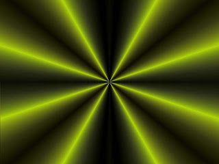
Another word for rhythm is repitition. It is the basic principle of design.
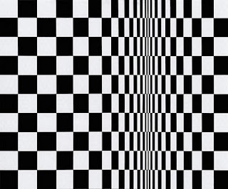
It is a principle of design indicating movement which is achieved by the repitition of beats, lines or shapes.
PROPORTION
When a design can be equally separated both vertically and horizontally, then it has the most entire balance possible,this is called symmetrical balance.
They would nearly have the same visual mass.
This piture above and below can also be divided equally.
ASYMMETRICAL BALANCE
It is an arrangement of contrasting items of the same mass on each side of the sheet. Color, worth, amount, shape, and quality can be used as balancing elements.
Asymmetrical balance is also the art of balance with a sense of unbalance.
Asymmetrical balance is also the art of balance with a sense of unbalance.
RHYTHM
It is a principle of design indicating movement which is achieved by the repitition of beats, lines or shapes.
PROPORTION
Proportion is the comparison of dimensions or distribution of forms.
It is the relationship in scale between one element and another.
EMPHASIS
It is something that stands out first and also gets noticed first.
Every layout needs a focal point to get some attention at the important part. A focal point is created when one element is different from others.
HARMONY
A principle of design, it refers to a way of combining elements of art to accent their similarities and bind the picture parts into a whole. It is often achieved through the use of repetition and simplicity.


No comments:
Post a Comment